You’ve seen it. An app that looks gorgeous on desktop, then you open it on your phone and something feels… off. The icons are either squinting at you—tiny, cramped, unreadable—or they’re so oversized they’re eating up half the screen. The feature still works. But the experience is broken.
Icon sizing is one of those things that looks simple on paper and is maddeningly complex in practice. After nearly two decades designing icons for everything from military software to consumer apps, I still have conversations with clients who are surprised this is even a design discipline on its own.
It is. And getting it wrong has real consequences.
What “multi-size optimization” actually means
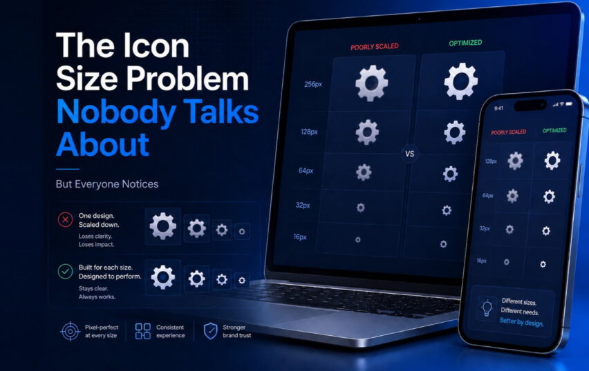
The phrase sounds technical, but the problem is human. An icon at 512×512 pixels and the same icon at 16×16 are not the same object. They shouldn’t look like one is just a shrunken version of the other—because when you shrink a detailed icon, you don’t just lose scale. You lose meaning.
Let’s take a settings gear icon. At large sizes, you can have 12 distinct teeth on the gear, soft shadows, a subtle inner glow. It looks refined. Now shrink it to 16px. Those 12 teeth become a blur. The inner glow disappears into noise. What was a gear now looks like a fuzzy circle.
The fix isn’t to just make the teeth thicker. You redesign the icon at that size. Maybe you use 6 teeth instead of 12. You simplify the silhouette aggressively. You adjust the negative space so the shape reads clearly. Same concept, completely different drawing.
This is why we create separate artwork for each size tier, not just SVG exports scaled down.
The sizes that actually matter
Every platform has its own logic, but here’s the practical reality for 2026:
Mobile (iOS/Android): App icons go from 1024px (App Store) down to 20px (notification icons). That’s a 50x range. You need distinct artwork at each major step—not just vector scaling.
Desktop software: Toolbar icons typically live in the 16–32px range. If your toolbar is crammed with functionality (think complex Excel add-ins), most icons are fighting for space at 16px. This is where clarity of silhouette becomes everything. No fine detail survives at that size.
Web and SaaS UI: Navigation icons are usually 20–24px. Larger decorative icons or feature illustrations might go up to 64px or beyond. These two contexts have almost nothing in common aesthetically, even when they’re representing the same function.
Spatial and mixed reality: And then there’s the new frontier. Spatial computing throws out most of our established sizing conventions. Icons in Apple Vision Pro or similar environments need to work from a foot away and three feet away, viewed at angles, with realistic depth. A whole separate problem that the industry is still figuring out.
The error I see most often
Teams design beautiful icons at large sizes. They put them in a Figma file, hand them off, and assume the engineering team will handle sizing.
What happens: the engineer exports one size, scales it everywhere, and ships.
The result is a product where the icons feel fine in screenshots (which are always shown at generous sizes) but break down in actual use. Users can’t describe what’s wrong. They just know the app feels rough, unprofessional.
This is especially painful for enterprise software. When you’re building a dashboard that people use for 8 hours a day, the small stuff accumulates. A toolbar with unclear icons costs your users a fraction of a second every time they look for a command. Multiply that by hundreds of interactions per day, per user. It adds up to real cognitive load and real frustration.
A quick test you can do right now
Take your current app icons and display them at every size you ship them at—actually render them at that physical size on screen, not in a zoomed-out design view.
Now answer these questions at each size: Can you identify the icon in under a second without reading any label? Does it look deliberate, or does it look like something went wrong? Does it match the visual weight of the icons around it?
If any answer is no, you have a sizing problem. Not a huge crisis—but something that’s quietly eroding your product’s quality every day.
The bottom line
Custom icon design isn’t just about making something that looks good at one size. It’s about making sure your visual language stays coherent and functional across every context your users encounter it. That requires intent, and it requires doing the work at each size tier.
The good news: when you get this right, it’s invisible. Users just feel like your product is polished and trustworthy without knowing exactly why.
That’s exactly what good icon design should do.
Working on a product that needs icons optimized for multiple sizes and platforms? Tell us about your project.