You’ve seen it. An app that looks gorgeous on desktop, then you open it on your phone and something feels… off. The icons are either squinting at you—tiny, cramped, unreadable—or they’re so oversized they’re eating …
Why your App’s first screen is the most important icon design decision you’ll make
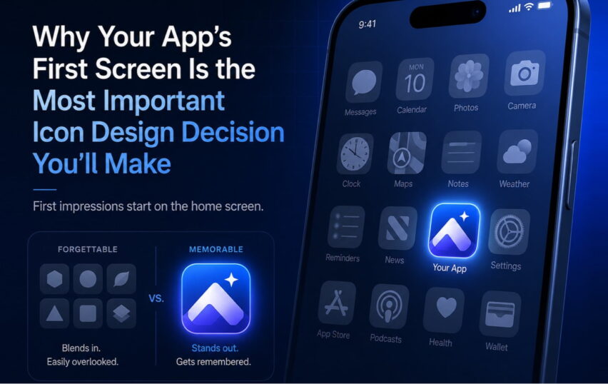
Here’s something I find fascinating: most product teams spend months debating features, refining onboarding flows, A/B testing button colors—and then spend about two hours on the app icon. That app icon is the first thing …
Custom icons vs. stock icons: Why your UI needs its own visual voice
Look, I get it. When you’re deep in a project and need icons fast, it’s tempting to grab a pack from a stock library and call it done. I’ve been there. But here’s the thing …
From Floppy Disks to Felt Clicks: How icons became a language we can touch
The invisible language you speak every day Think about how many icons you’ve tapped today. Dozens? Hundreds? From unlocking your phone this morning to closing your last app tonight, you’re constantly reading and responding to …
6 UX design trends that will define 2026
I’ve been in this industry long enough to see trends come and go. I’m working with an eCommerce and web design agency since 2003 and founded Iconiza in 2007. Every January, we get bombarded with …