Here’s something I find fascinating: most product teams spend months debating features, refining onboarding flows, A/B testing button colors—and then spend about two hours on the app icon.
That app icon is the first thing your user sees. Before the onboarding. Before the features. Before any of the careful UX work you did. It’s sitting on their home screen, competing with every other icon for attention. And it’s the single frame that represents your entire product when someone is deciding whether to open it again after the first time.
Two hours. For that.
The home screen is a crowded place
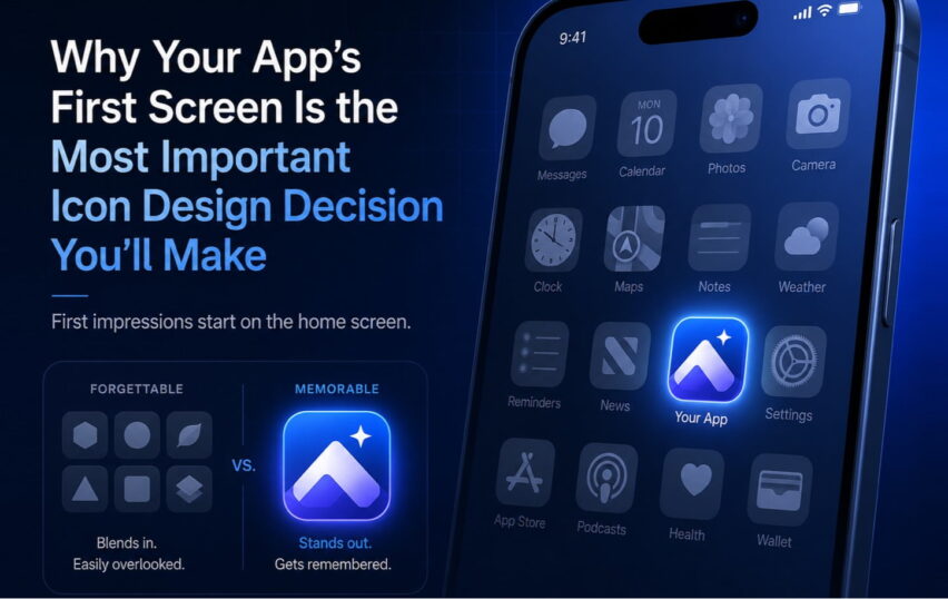
Think about your own phone. You’ve got maybe a hundred apps installed. How many can you identify instantly by icon alone, without reading the name? Probably a couple dozen at most—the ones you use every day, and the ones with genuinely distinctive icons.
Everything else? You’re reading labels. Which means that icon isn’t doing its job.
This is the bar. Not “looks nice.” Not “represents what the app does.” Instantly recognizable at a glance, on a crowded screen, when you’re in a hurry. That’s what a great app icon does.
The three things a great app icon actually needs
I’ve looked at a lot of icons over 19 years. The ones that work share three properties, and they’re harder to achieve together than they look.
A clear silhouette. The shape should be readable in a single glance, even at small sizes. This is why the most iconic app icons—the ones you can recognize in a split second—tend to use bold, simple forms. Not because simplicity is a trend, but because simple silhouettes communicate faster.
Brand coherence. The icon can’t exist in isolation. It has to connect to the rest of the product’s visual identity—the color palette, the personality, the UI. Users who open an app and find a completely different visual world than the icon promised feel a subtle dissonance. It’s the visual equivalent of a bait-and-switch.
Distinctiveness on the platform. Your icon doesn’t live in a white void. It lives next to Apple’s default apps, Google’s apps, and whoever else is on your user’s home screen. An icon that looks great in isolation might completely disappear in that context. You have to design for the real environment.
Where I see teams go wrong
The most common mistake is designing the icon too late in the process, when the visual identity is already locked and the team is running out of time.
So what happens? Someone adapts the logo. Drops it in a rounded square, maybe adds a gradient, ships it. It technically “represents the brand.” But an app icon isn’t a logo treatment. It’s a different communication challenge entirely.
The second mistake is designing for the portfolio screenshot, not the home screen. An icon can look stunning in a mockup at 512px. Put it at 60px next to Apple Maps and Spotify and suddenly it’s invisible. This is why I always test icon candidates at actual device size, on actual device home screens, before making a call.
The third mistake is committee design. App icons are one of those things where too many opinions produce mush. Someone wants the company name in the icon. Someone wants the mascot. Someone wants it to match the color scheme they presented to investors. Everyone’s input is legitimate but the result is an icon that satisfies everyone’s concerns and communicates nothing.
What good looks like
The icons people cite as great—Instagram’s gradient camera, Spotify’s black circle, the original Apple skeuomorphic icons—weren’t accidents. Each is the product of a clear decision: what is the one thing this icon communicates?
Not five things. One thing. What feeling, what idea, what visual signal does this need to land?
When you can answer that question clearly, the design process gets a lot simpler. When you can’t, no amount of refinement is going to save you.
A thought before you launch
If your app icon is a cropped version of your logo with a colored background, I’d invite you to revisit it. Not because it’s wrong, exactly—but because it’s almost certainly leaving recognition and identity work on the table.
The app icon is a brand asset. For many users, it’s the brand asset they interact with most. It deserves the same care and craft as the rest of your product.
Need an app icon that actually works on the home screen? We’ve been doing this since 2007.