Most UX audits live inside PowerPoint decks that nobody reads. They’re expensive, they take weeks, and they produce a hundred recommendations that get prioritized down to nothing because nobody knows where to start.
I want to give you a different version. A 20-minute check you can run on your own product today—no external consultants, no research budget—that will surface the highest-impact problems in your interface. I’ve been doing this as a first-pass diagnostic for clients since before there was a formal name for it.
It won’t catch everything. But it catches the things that matter most.
The three questions that expose 80% of UX problems
Before touching anything in your product, ask these three questions:
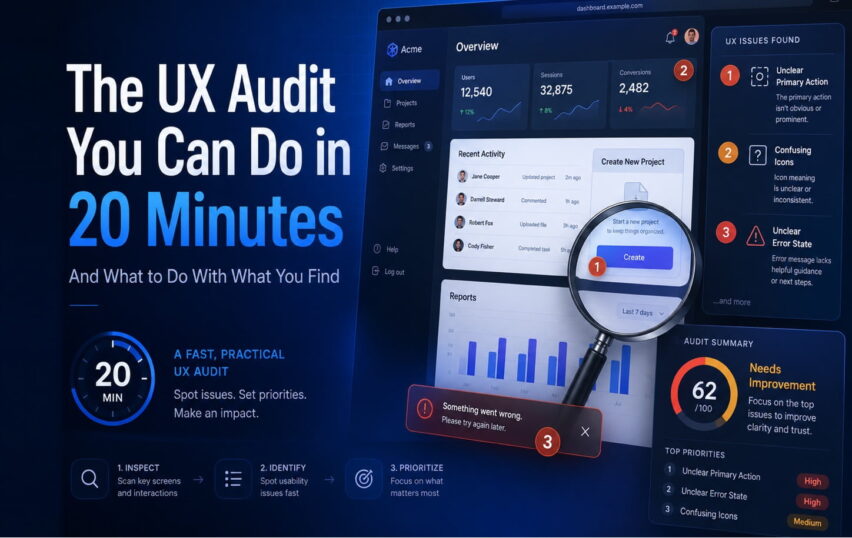
1. Can a first-time user figure out the primary action in under 10 seconds?
This is the single most important question in UX. Your product exists to help people do something. That thing should be immediately obvious without any instruction. If you need a tooltip, an onboarding modal, or a tutorial to point people at the main feature, the interface isn’t doing its job.
Test this empirically. Find someone who has never used your product—a family member, a colleague in a different department, anyone. Put it in front of them, say nothing, and watch. If they hesitate for more than 10 seconds, or click somewhere you didn’t expect, you have a problem.
2. Is it obvious what’s interactive and what isn’t?
This one is subtle but pervasive. As interfaces have gotten more minimal, the visual signals that used to distinguish buttons from labels have gotten quieter. Flat design removed a lot of useful affordances. Now we have paragraphs of text sitting next to clickable elements with almost no visual distinction between them.
Walk through your screens and point at every element. For each one, ask: if I showed this to someone who had never seen this UI, would they know this is tappable? Shadows, borders, color contrast, underlines, hover states—these are doing real work. Don’t strip them out for aesthetics.
3. What happens when something goes wrong?
Most products are designed for the happy path. You fill out the form correctly, the API works, the data loads. But users don’t live on the happy path. They type invalid inputs, they lose their connection, they try to do something the system doesn’t support.
Error states are where UX falls apart most spectacularly—and where it’s easiest to improve quickly. Go find your error messages right now. Are they in plain language? Do they tell the user what happened and what to do next? “Error 403” is not an error message. “Something went wrong” is not an error message. “We couldn’t save your changes—check your internet connection and try again” is an error message.
The icon and visual language check
Since this is where we live: take 5 minutes and look at your icons specifically.
Do they all look like they belong to the same family? Mixed stroke weights, inconsistent corner radii, some filled and some outlined—these inconsistencies don’t read as a single bug. They read as an overall lack of care. Users feel it even when they can’t articulate it.
Do they communicate their function without labels? In a perfect world, you shouldn’t need a label under every toolbar icon. In practice, labels help. But if your icons require labels to be comprehensible, they’re working too hard. Test by covering the labels and asking someone what each icon does.
Are they readable at the size you’re actually using them? We covered this in a previous post. The short version: view your icons at actual size, not design-file size. They should be clear at that scale, not just in the asset preview.
What to do with what you find
Here’s where most audits fail. You find 30 problems and have no idea where to start.
Simple rule: fix the path to the primary action first.
If the core flow—the thing your product exists to do—has friction, that takes priority over everything else. A beautiful error state on a feature nobody can find doesn’t help anyone.
After that, prioritize things that break trust. Confusing icons, inconsistent visual language, error messages that feel like the product is hiding something—these erode confidence in the whole product, which affects retention and referrals in ways that are hard to measure but very real.
Save the polish for last. The things that are merely “could be better” rather than “causes problems” can wait until the foundational issues are addressed.
The 20-minute schedule
- Minutes 1-5: The first-time user question. Go through onboarding cold, with fresh eyes, taking notes.
- Minutes 6-10: The interactivity check. Click or tap every element in your core screens. Note what’s confusing.
- Minutes 11-15: Error states. Force every error condition you can. Read the messages out loud.
- Minutes 16-20: Icon audit. Labels off. Do you know what each icon does?
At the end of this, you should have a list of 10-20 specific, actionable issues. Pick the top three that affect your main user flow and start there.
It’s not a substitute for deep user research. But it’ll show you things you’ve stopped seeing because you’ve been looking at this product too long—and some of those things are costing you users right now.
If your icon and UI audit surfaces problems that go beyond quick fixes, we can help you design a visual system that actually works.